NOC at Sunrun

Redefining Data Visualization and Powering Grid Operations at Sunrun
Sunrun’s Network Operations Center (NOC) provides insights into the company’s extensive fleet of residential solar and storage systems. With Sunrun scaling its participation in grid services programs across the United States, the existing experience needed to support new roles, workflows, and more proactive monitoring capabilities.
What began as a request to prototype the path towards technological enablement evolved into a broader initiative to address existing user pain points and consolidate data visualization patterns for an emerging design system. Over two months, I paired with a supporting designer to deliver a library of data visualization components, patterns, and guidelines, as well as a redesigned NOC that supports more integrated workflows and a broader set of use cases.
The Process Involved
Uncovering Core Needs with Prototype-Driven Research
With little documentation on who actually used NOC, we began by whiteboarding with the product manager and three grid services program managers. This session, along with subsequent stakeholder interviews, clarified critical goals such as eliminating the error-prone, time-consuming reliance on cross-referencing multiple spreadsheets for program enrollment and monitoring tasks.
Although functional requirements were still in flux, these initial discussions helped us form hypotheses about the ideal information hierarchy and the new data and actions needed. We then shared early prototypes with monitoring analysts and grid services program managers to validate our assumptions. As analysts walked us through their workflows, the tests revealed that they need broader system visibility to manage operations proactively. Additionally, we learned they often had to convey complex data to less technical audiences, including customer care agents, field service technicians, and sometimes customers—underscoring the necessity of scalable data storytelling.
Refining Designs through Iteration, Testing, and Cross-Functional Alignment
Throughout the design process, we explored page layouts and information hierarchies for both a conceptual dashboard as well as the NOC’s existing site page. Whether isolated or integrated into the site page, each data visualization component we designed or redesigned underwent multiple rounds of think-aloud testing to validate usability and discover any remaining gaps in core functionality. In our weekly design critique with designers across other internal tools and customer-facing platforms, we reviewed our most recent developments in creating guidelines for and standardizing data visualization patterns. With engineers, we kept a close feedback loop on both a daily and weekly basis, walking through our iterations to ensure that every interaction aligned with engineering capabilities for our timeline and scope.
Optimizing Workflows
Introducing the Triage Table
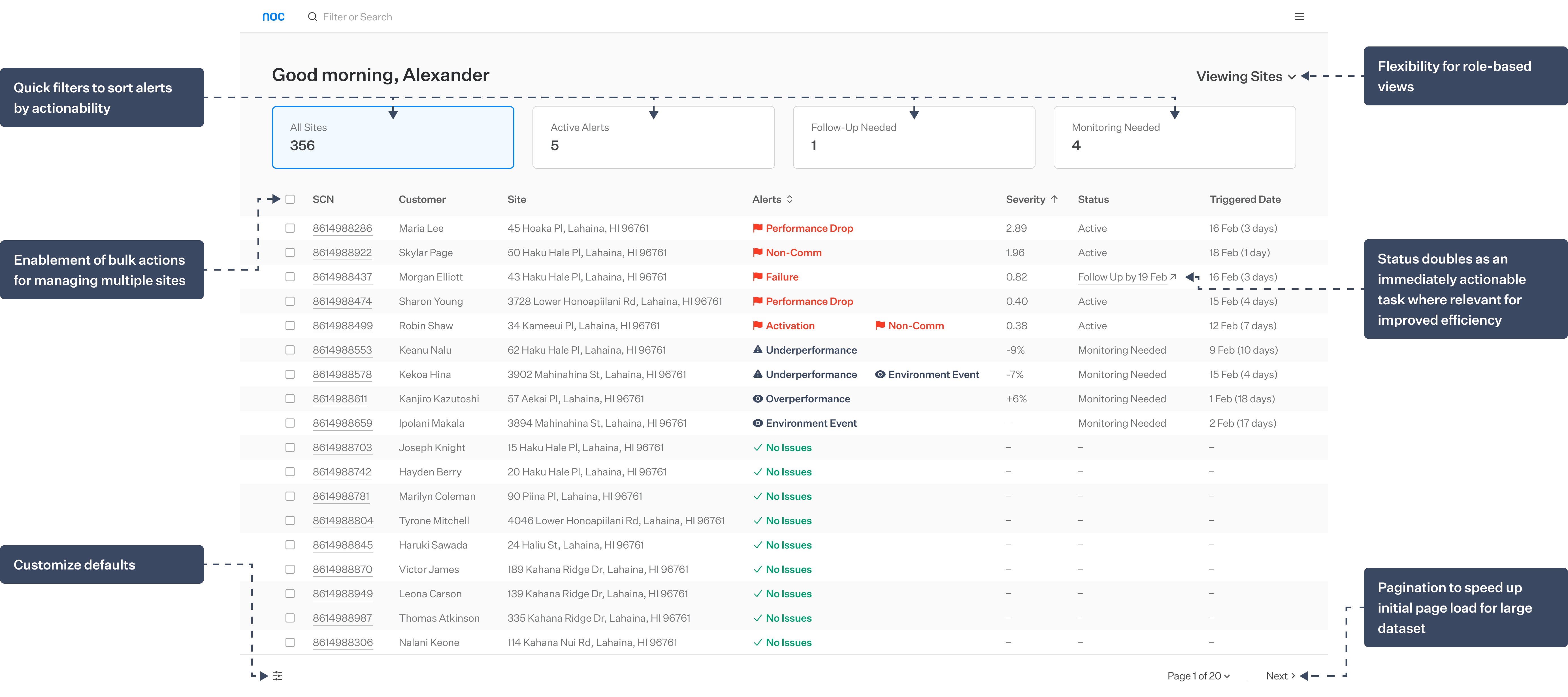
Triage work where it is done.
Replacing NOC's blank-page entry point, a triage table aggregates data from multiple sources, quickly surfaces systems that need oversight, and gives users a single platform to both manage and go on to complete their tasks.
Highlighting actionable data
Redesigning the Site Page
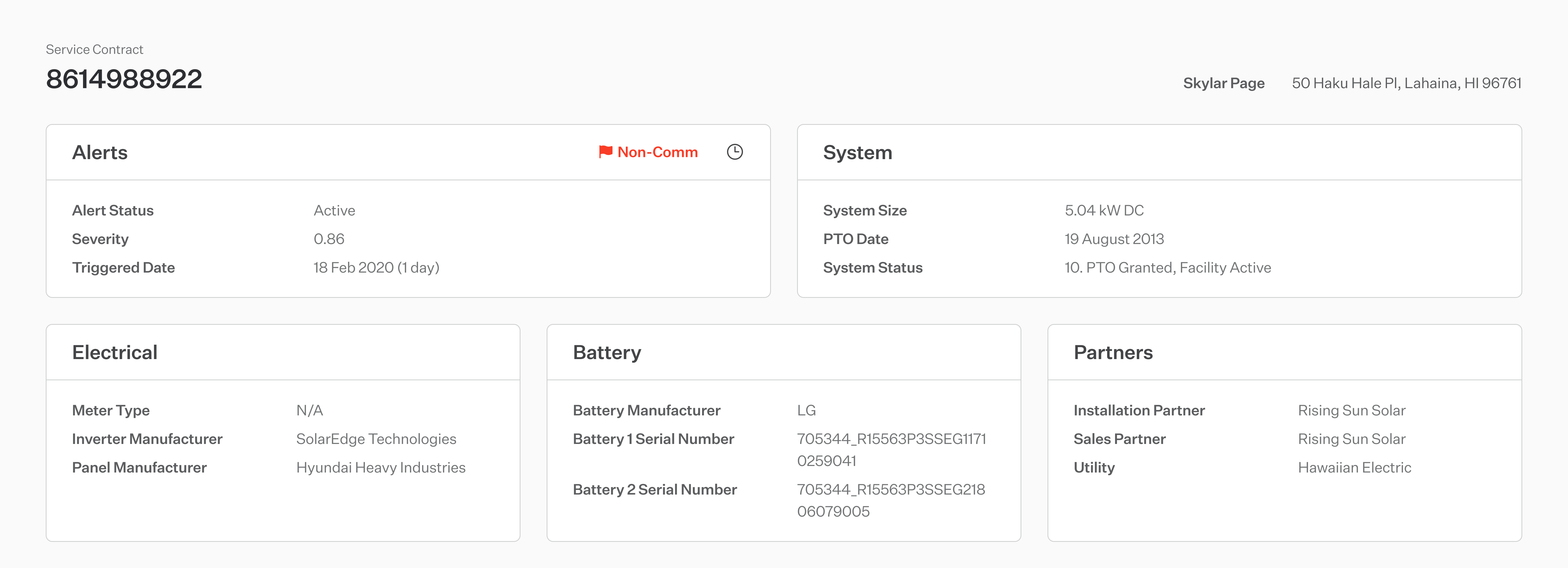
Assign all data a home.
Card components group key site information, enhancing scannability and adapting easily to evolving data needs.



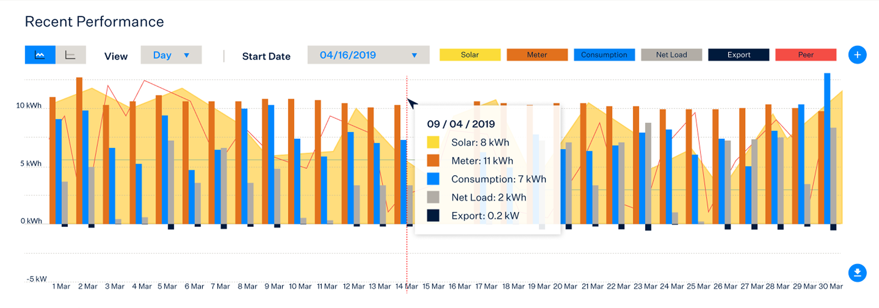

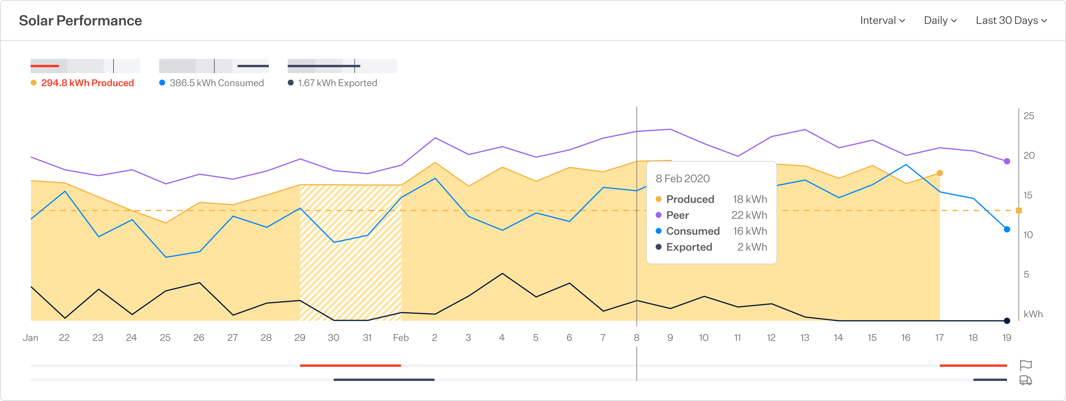
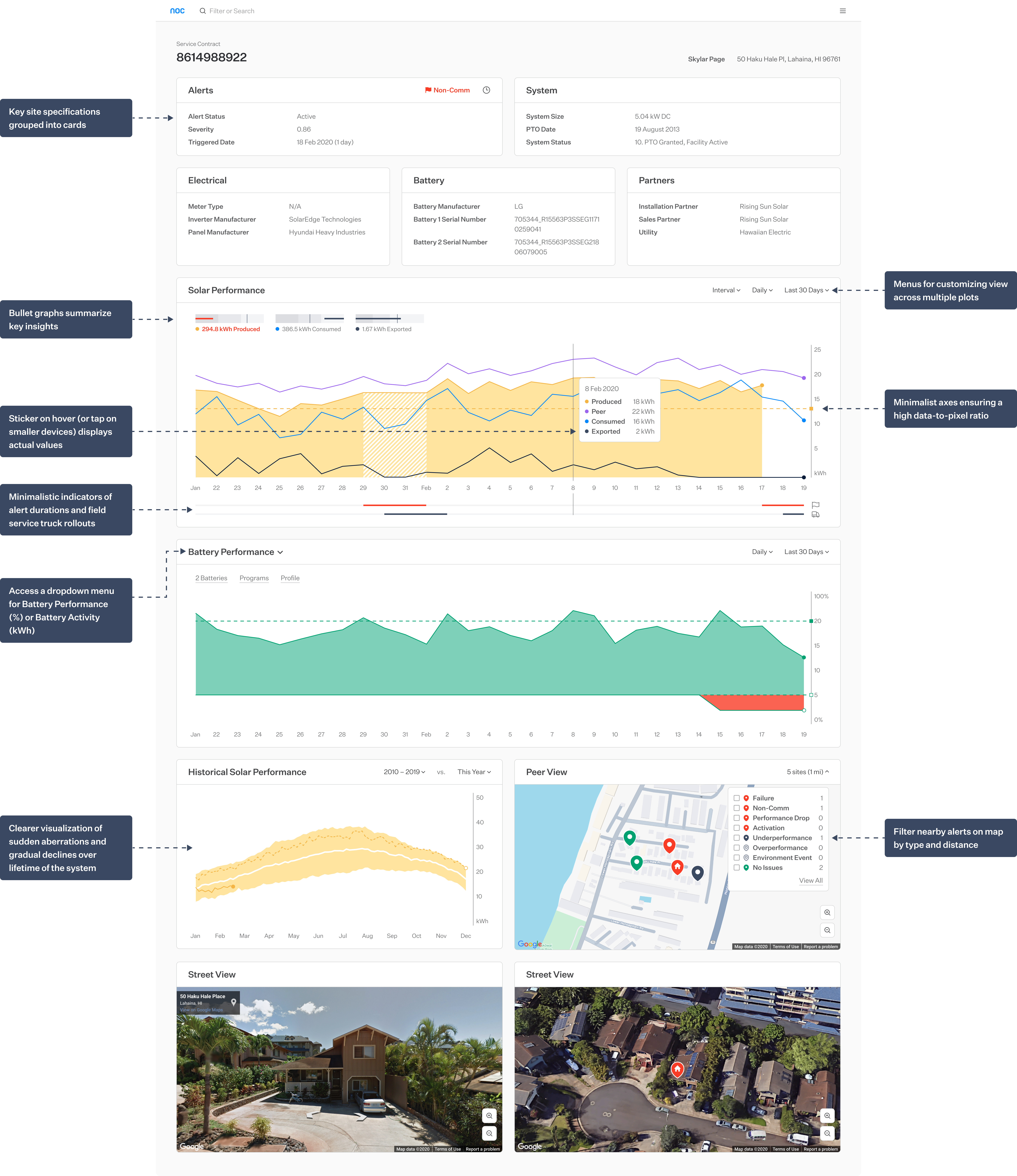
Establish a visual hierarchy.
Combined area and line graphs let users quickly spot trends and diagnose alerts. Primary data is highlighted with a filled area plot, reference values appear as unfilled lines, and contracted figures are represented as dashed lines.
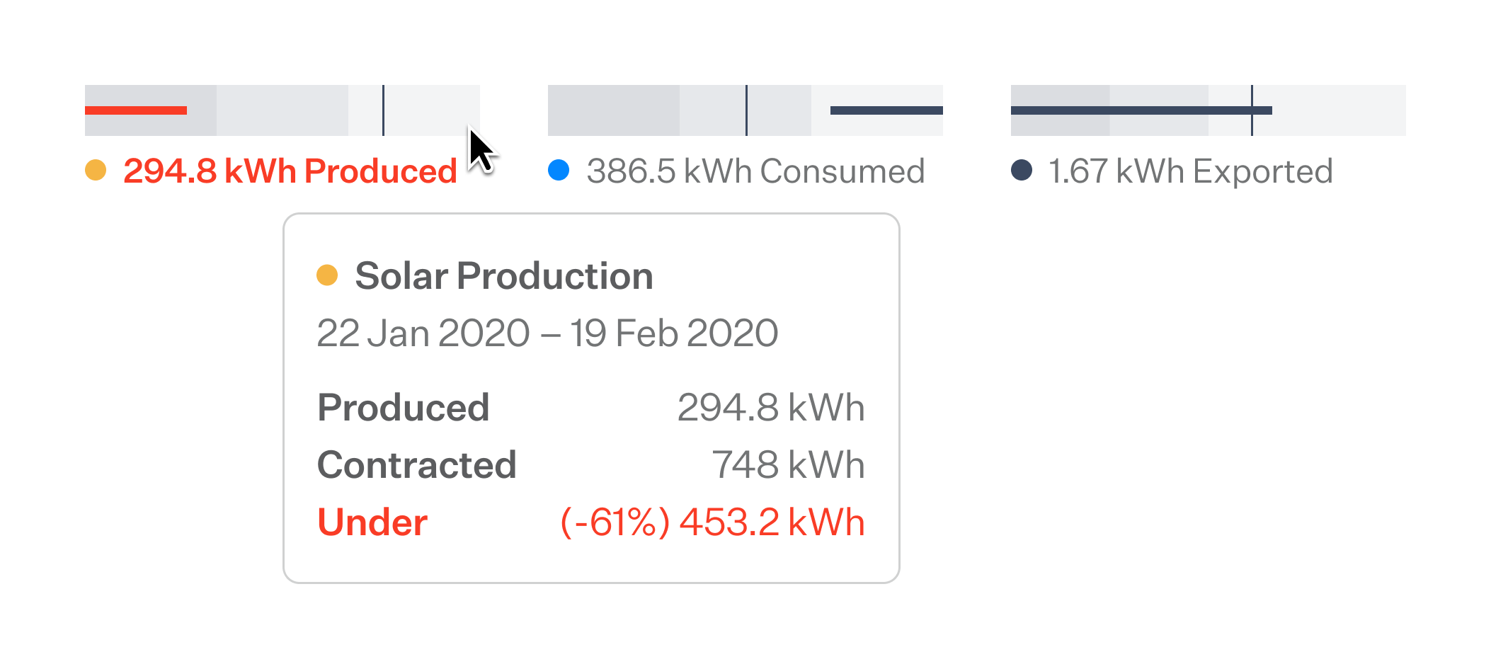
Summarize and progressively disclose key insights.
Each data set is distilled to a key metric that is then compared to a reference value in a bullet graph. Hovering or tapping reveals additional context.
Standardizing Design patterns
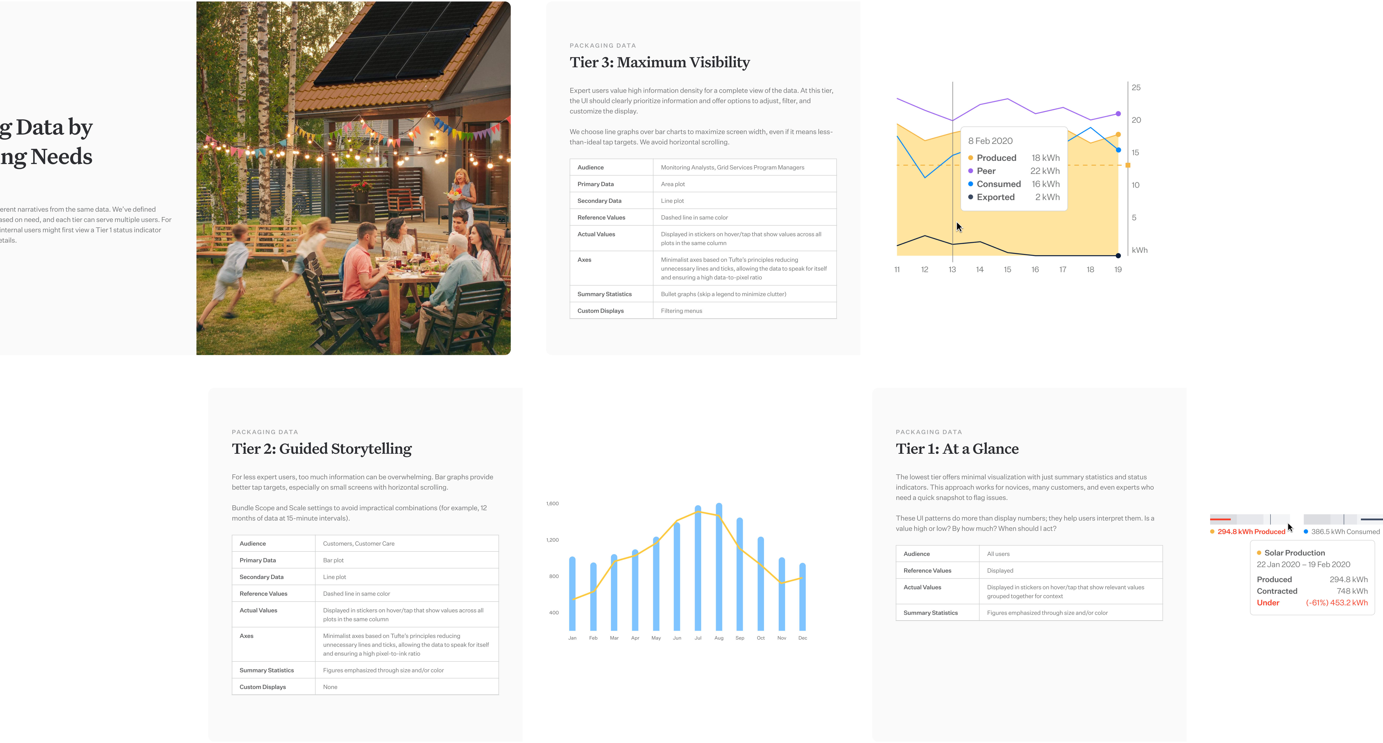
Publishing a data visualization playbook
We rolled out patterns and best practices across Sunrun.
Alongside new designs for NOC, we seized this project as an opportunity to uncover data visualization use cases, iterate on components and patterns, and establish guidelines for designers across the company.
